Back in 2009 when I studied Information Design with a major in User Interface Design, I developed my own model of User Experience. I don’t think that there’s this one model that will solve all problems. Rather, I look to the practice of creating this model as a sort of dissection of interaction and all things involved.
I was an avid fan of Don Norman back then; actually I’m still. The book Emotional Design got me onto the track of dividing all experience up into three layers. Don Norman uses the terms Visceral Layer (bodily sensations), Behavioral Layer (interactions) and Reflective Layer (art and meaning). If you want to learn more about the layers, I urge you to get the book. It’s well worth it!
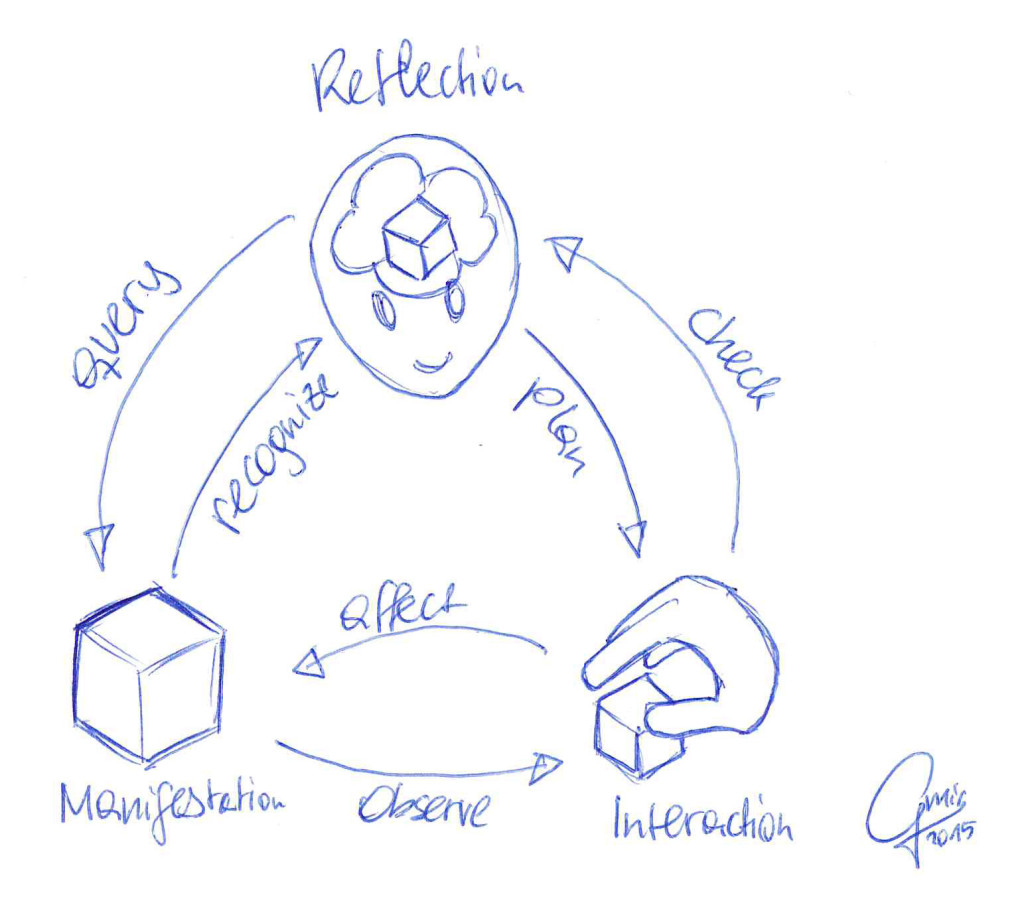
I thought, what if there are some interactions between those Layers? What if they are like objects that communicate with each other? So I tried to find suitable names for things on each layer. The generic model uses these:
 |
|
So then I thought, what are the communications between those instances? How do we get from Manifestation to Interaction? And how does Interaction build up your Reflection? This is where (to me) the magic happens. The communications between these instances is what needs to be optimized for good user experience on an atomic level.
affect (Interaction to Manifestation)
You want to affect the thing. The interaction tells you what to do, so you try to apply force at the object. We are not talking about why you do it. The first step is just doing it.
Examples of bad affect UX
- The object is too heavy to affect it (resistance)
- You lack the tools to be effective
Mantra: Being effective is about having the power to do things.
observe (Manifestation to Interaction)
When we look at an object or when we handle it, the first thing is that we take in a lot of sensual information. Observations. For ideal observation, these inputs happen imminently but gently. We need feedback to evaluate if we are effective.
Examples of bad observe UX
- Long wait for feedback
- Imperceivable feedback (no communication)
- Too much feedback (overload)
Mantra: Imminent but gentle feedback to provide information
check (Interaction to Reflection)
When we receive information through observation, we can start to analyze our interaction. Are we doing fine? Is this what we wanted? This part becomes clearer when we see its opposite sibling plan (Reflection to Interaction). For now we compare our feedback with whatever we expected. This can lead to problems if the expectations are wrong.
Examples of bad check UX
- The feedback is not understandable (foreign language for example)
- The feedback is misleading like progress bars that fill aprubtly and do not illustrate the actual progress (obscure design).
- Something unexpected happened; this is a pretty common case when people have different previous experiences with things. (wrong expectations)
Mantra: Feedback needs to fit the expectations and must use understandable (design) language
plan (Reflection to Interaction)
We acquire information all the time. Through experience we build mental models that we act upon in our thoughts. We think stuff like „if I press the button, X will happen“ before we actually go and do it. Our mental model (or as I call it Reflection) is nearly never perfect. It is formed by experiences, and we owe it to the user to build stuff that is learnable.
Examples of bad plan UX
- The button did X all the time, but now does Y. (change of rules)
- The context of interaction changed. (like behavior that’s okay in one culture can be considered rude in a different culture; or an interaction you heavily used on Windows leads to problems on a Mac)
Mantra: Make the context of interaction clear and do not change the rules arbitrarily
recognize (Manifestation to Reflection)
There is a shortcut (or rather a special form of Interaction) that connects Manifestation and Reflection. I call this recognize, and it is the moment you think you know what something is. You see a button and you recognize it as a button. It connects the perception to a mental model, which allows you to know how to operate the thing. This is not without pitfalls though!
Examples of bad recognize UX
- Something looks like a button but is a label (deceptive design)
- An edit field looks like a label so you don’t know that you can type in it (deceptive design)
- A product’s packaging is perforated so you think you can rip it open, but actually the perforation served a different purpose (unintended communication)
Mantra: Similar things should look similar, but different enough to be unique and distinguishable
This is a tough one and needs a bit explaining. In a nuclear reactor, all the buttons are without labels. This does not work, clearly, because although you know how to operate buttons, you do not know what the individual buttons will do. The beauty of design is that it always can communicate upwards (more abstract) and downwards (more concrete). If it is supposed to be pressed, it has to look like a button (abstract). If it will trigger an explosion, it needs to be designed differently from the common buttons; for example with a label, and icon and a different color (concrete).
Deceptive design happens all the time when new design styles show up and get in vogue. Suddenly buttons are flat, so the impression of a 3D button is removed. People handle this differently, depending on their previous experience and their will to try out things. If you buy toxic bleach and it smells and looks like strawberry juice, you are up for a surprise.
query (Reflection to Manifestation)
This communication happens when we look for something. You might go out into a shopping mall and look for food. Everything that you consider to be food will trigger a response. If a product’s packaging is bad, you might not realize that it is food, so you will just walk by.
The same thing happened to me with certain doors. Before I got my electronic key dongle, I just walked to the door and tried to open it. The design was bad, because it implied that I could just open it with the typical mechanism. The affordance told me only half the truth. I needed to unlock the door with my ID, but the reader was hidden, probably because of lack of space. Bad UX.
Examples of bad query UX
- You look for certain brand products, but the company has changed the packaging to look completely different (deceptive design again)
- You want to close a window and look for an X, but the actual way to close the window is a small stop sign that is hidden in the bottom right corner (intentionally deceptive)
Mantra: Make stimuli recognizable and consistent
Epilogue
This model helped me acquire a better understanding of UX. Maybe it will prove useful to you as well. There is one possible addon mantra to keep in mind:
Mantra: Sometimes challenges make products better
Not every product benefits from ease-of-use. A lot of games intentionally break those mantras so you can best those situations. You can clearly categorize games according to the parts that they intentionally make difficult.
- Weight-Lifting, intentionally hard affect UX (heavy resistance)
- Memory Card Game, intentionally hard recognize UX (intentionally deceptive)
- Bonsai Keeping, intentionally hard observe UX (slow feedback)
I hope these Mantras will help you!
Let me know what you think!